Challenge 1: Hosting and embedding charts
Here's one chart.
Here's a second chart. I thought this one was fun.
Nothing fancy.
Challenge 2: Building and creating my own visualizations
A chart of UK unemployment over time made with the Economic Observatory "Create" tool.
A chart of UK debt over time made with the Economic Observatory "Create" tool.
Challenge 3: Debate - Use a visualization in policy commentary
It seems like the second Trump administration is moving faster than the first Trump administration to implement its policy changes. Are ICE arrests ramping up faster under the second Trump administration compared to the first? Here are two charts that I made with data from the Deportation Data Project obtained through Freedom of Information Act requests from the U.S. Immigration Customs and Enforcement (ICE) Agency. The first shows occurrences of ICE arrests by month from the beginning of Fiscal Year 2016 to July 2017 and the second shows occurrences of ICE arrests Fiscal Year 2024 through July 2025. The red lines indicate the dates of the first and second inaugurations of President Trump, respectively.
Looking at the histograms, the sheer number of arrests in the first few months of Trump 2.0 far surpass that of Trump 1.0. Not only that, but the difference between the period immediately before inauguration and after inauguration are much more distinct in Trump 2.0 compared to 1.0.
Challenge 4: Replication - Re-create, then improve someone else's chart
This chart is located in an article from the Migration Policy Institute titled, "U.S. Immigrant Detention Grows to Record Heights under Trump Administration". You're able to see a general trend in the chart, but it could be more clear.
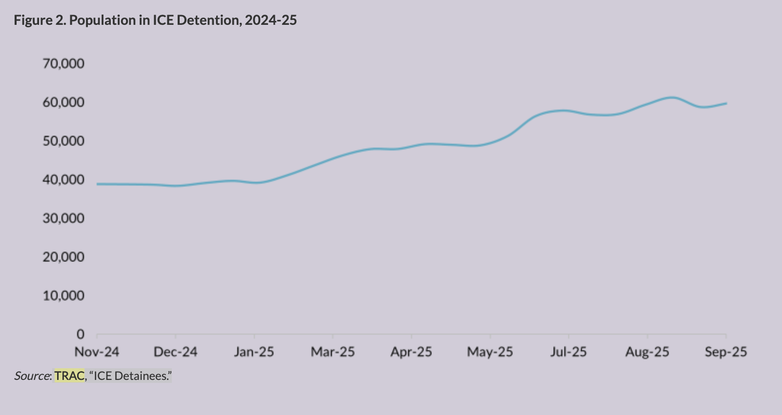
I used the same data set from TRAC Reports to recreate the chart with grid lines to more clearly identify the x and y values on the line. I also included a y-axis label and a hover function to show more precisely the exact number of detentions on all given dates in the dataset.
Challenge 5: Accessing data - Scrapers and APIs
API
Base URL: https://api.worldbank.org/v2/
Indicator for fertility rate: indicator/SP.DYN.TFRT.IN
JSON format: ?format=json
Date range: &date=1960:2025
Getting data in one call: &per_page=160
Final URL:
https://api.worldbank.org/v2/country/kor;prk/indicator/SP.DYN.TFRT.IN?format=json&date=1960:2025&per_page=160
Scraper
I scraped roll call data from the House of Representatives on a bill called the Laken Riley Act
and created a bar chart that illustrates votes by party.
View
on Google Colab
Challenge 6: Loops - Build a dashboard
Six countries showing the proportion of seats held by women in national parliaments over time,
displayed in a grid format using a JavaScript loop.
View on Colab
Challenge 7: Maps - Base maps and chloropleths
Coordinate
Here is my coordinate map of authorised landfills in Wales. Locations were in UTM, so I converted each point to Longitude/Latitude.
Chloropleth
Here is a chloropleth map that uses data from the UK Office of National Statistics that shows the percentage of cigarette smokers by local authority.
Challenge 8: Big Data
I used AutoCPI time series data to map prices of products over time. In the first chart, I mapped
the mean and median price of can of beans. In the second chart, I compare the prices of a kilo
of canned tuna with a kilo of fresh fish over time.
View
on Colab
Here is my bean chart.
Here is my fish chart.
Challenge 9: Interactive Charts
Here are some interactive charts that are also in my project!
Challenge 10: Advanced Analysis and Machine Learning
Advanced Chart
Machine Learning
- Cluster 0: Higher share of people from Ecuador and Dominican Republic, and who do not
have no criminal record
- Cluster 1: Higher share of people from Mexico, and who have criminal charges, either
pending or convicted
- Cluster 2: Higher share of people from Mexico, and who do not have no criminal record
- Cluster 3: Higher share of people from El Salvador and Guatemala, and who do not have no
criminal record
I used K-means clustering to find out which regions had ICE arrests with similar characteristics
(age, gender, nationality, and criminal record). I found that there was one cluster that
included the central and Southern parts of the United States that was defined by high shares of
people arrested who have criminal records. The rest of the clusters had lower rates of people
arrested with criminal records, but varied with higher shares of different nationalities.
View
on Google Colab